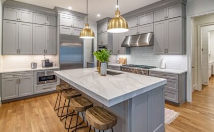
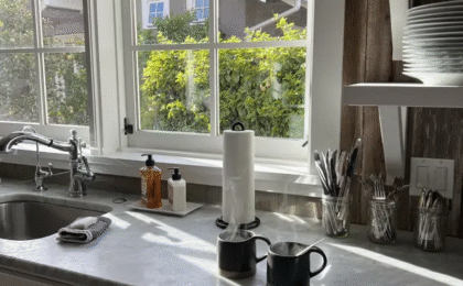
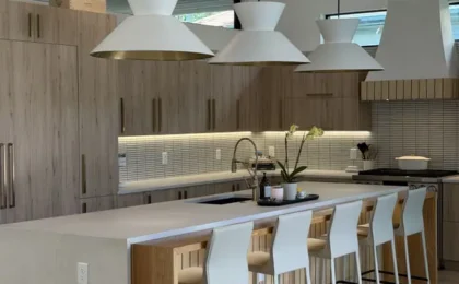
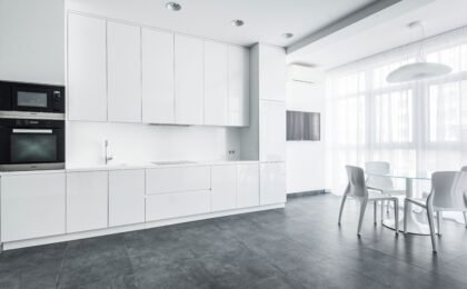
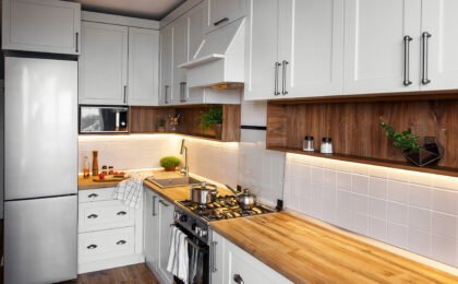
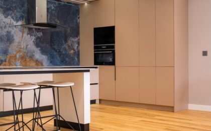
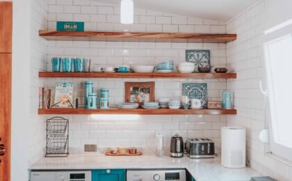
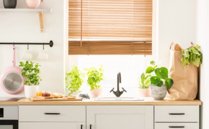
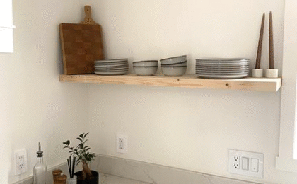
When we delve into the fascinating universe of interior architecture, high-end residential remodeling, and meticulous kitchen design, we tend to make the initial mistake of focusing one hundred percent of our attention on the color palette or the geometric layout of the space. However, the most exquisite, immersive, and sensory interior design projects of the contemporary landscape go far beyond the purely visual plane. The true premium category of a room is experienced through touch, the friction of materials, the volumetric richness of surfaces, and mastery in combining contrasting textures.
In the 21st-century home, the kitchen has ceased to be a sanitized, cold workspace to become a highly living space where the senses play a starring role. Mixing matte and gloss surfaces, rough textures, and perfectly smooth finishes is not just a passing aesthetic trend; it is a sophisticated architectural tool to provide depth, visual rhythm, and unparalleled personality to the heart of your home. How can we successfully combine an amalgam of tactile textures in kitchen design without falling into visual excess or decorative chaos? We analyze the master keys of this sensory trend.
1. The philosophy of tactile contrast: Beyond visual impact
Textural contrast involves introducing materials with opposite or complementary physical and tactile properties within the same architectural space. While the human eye perceives color immediately, touch—both real and visual—provides a psychological dimension of warmth, comfort, and sophistication that completely transforms the experience of inhabiting the room.
- Breaking visual flatness: A kitchen composed entirely of identical surfaces (whether all ultra-glossy or all completely matte) tends to generate a monotonous, flat atmosphere devoid of soul. The juxtaposition of the rough with the smooth, or the reflective with the absorbent, energizes the volume of the furniture.
- Sensory balance: The intelligent mixing of textures allows a kitchen with very modern and streamlined architectural lines to avoid feeling cold, integrating organic elements that bring humanity and closeness to the environment.
2. The eternal duel: Matte surfaces versus ultra-glossy surfaces
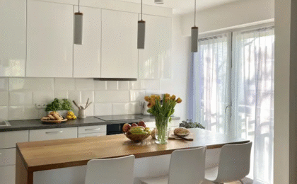
Choosing between matte fronts and glossy finishes is one of the pivotal decisions in any kitchen design project. Far from having to choose exclusively between one of the two options, the most advanced strategy is to combine them with rigorous aesthetic criteria.
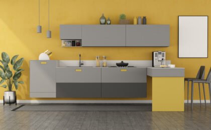
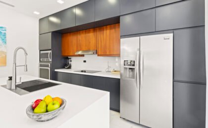
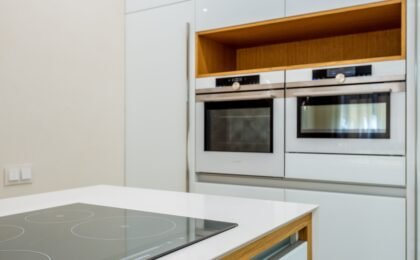
- The sober elegance of matte (anti-fingerprint): Matte lacquered finishes or ultra-smooth laminates of the latest generation (such as nano-tech treatments) diffuse light, transmitting a sensation of calm, depth, organic elegance, and sober sophistication. They are perfect for the main blocks of columns and upper cabinets.
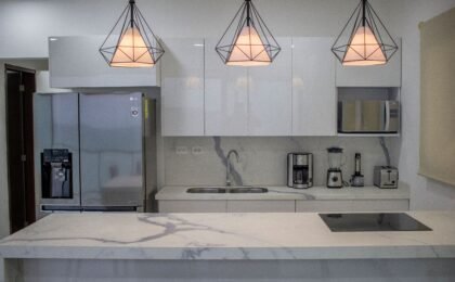
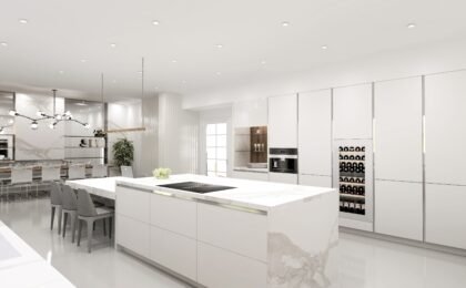
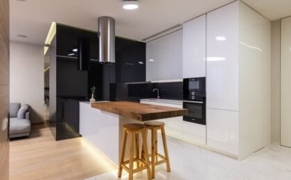
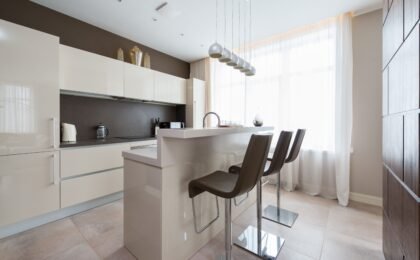
- The reflective dynamism of gloss: High-gloss fronts (high-quality lacquered or acrylic) act as subtle mirrors that multiply natural and artificial light beams, generating optics of greater spatial amplitude. Reserving gloss for specific fronts or for the central island creates a very attractive luminous contrast against the matte perimeter.
3. The material counterpoint: Mixing the rough and the perfectly smooth
The second major axis of tactile duality in kitchen design lies in the contraposition between the industrial perfection of ultra-smooth surfaces and the organic rawness of rough, porous, or slatted textures.
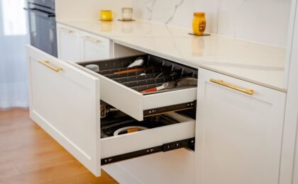
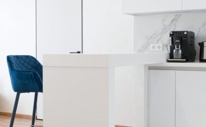
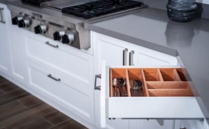
- The technical perfection of smooth fronts: Handleless panels, with openings via push-open systems or milled finger-pull profiles, offer a clean and minimalist visual continuity that brings absolute order and modernity to the room.
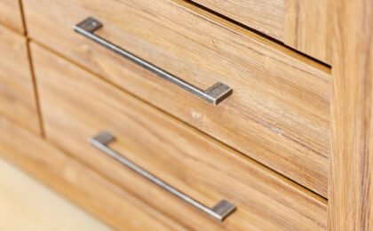
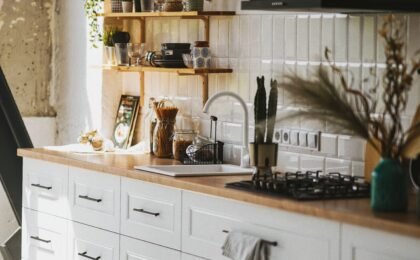
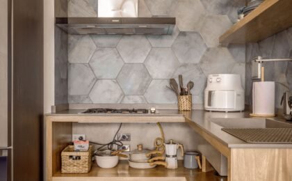
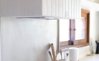
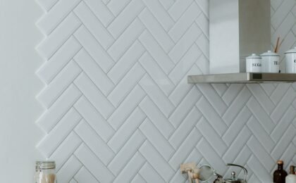
- The tactile richness of the rough: Introducing elements with relief—such as solid woods with marked knots and grains, vertical slatted fronts, flamed natural stone, microcement coatings, or artisanal ceramic tiles with irregular texture—breaks the coldness of extreme minimalism. Touching a porous or embossed surface in the breakfast bar area activates an immediate sensory connection with the nature of the materials.
4. Application strategies by zone in kitchen design
To prevent the mixture of textures from feeling overwhelming or chaotic, it is essential to apply contrasts hierarchically and in a balanced way, assigning each tactile property to a specific functional element of the room.
- Column and storage zone (Matte and tactile base): Large volumes of built-in cabinets benefit enormously from matte finishes or silky-touch textured woods that reduce the visual impact of heavy blocks, integrating them fluidly into wall architecture.
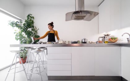
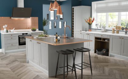
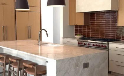
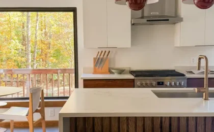
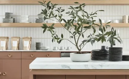
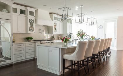
- The central island as an sculpture of contrasts: The kitchen island or peninsula constitutes the ideal setting to concentrate the play of textures. We can design a main body completely smooth in a silk finish and accompany it with a cantilevered breakfast bar in knotty solid oak or a sintered stone bench with a rough tactile texture.
5. The crucial role of countertops: Where texture meets function
The countertop is the surface of greatest physical and visual prominence in kitchen design, and also the one with which we maintain the most constant tactile contact throughout the day.
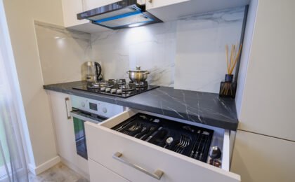
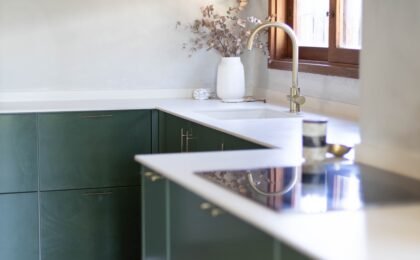
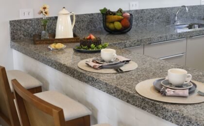
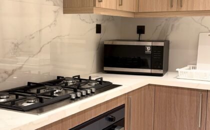
- Leathered, flamed, and bush-hammered finishes: In contrast to traditional ultra-glossy polishes, rough matte, textured, or velvety tactile textures in porcelain, granite, or quartz countertops provide unmatched tactile sophistication. When passing a hand over it, the surface conveys the sensation of artisan-worked natural stone.
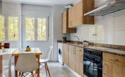
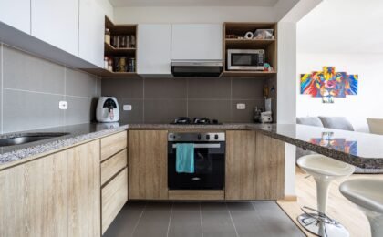
- Contrast with furniture: If the lower furniture has a very soft matte finish, a countertop with a slight stony texture generates a subtle yet high-end contrast that enriches the overall visual appeal.
6. Technical lighting: The catalyst that reveals textures
Rough textures, deep mattes, and specular glosses do not achieve their true splendor on their own; they need precise lighting engineering that interacts with their reliefs.
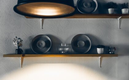
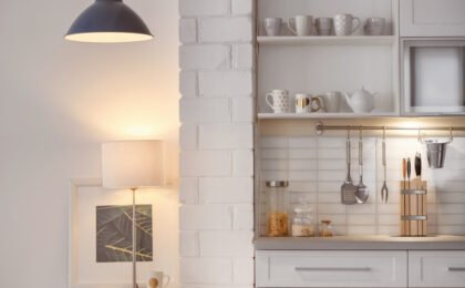
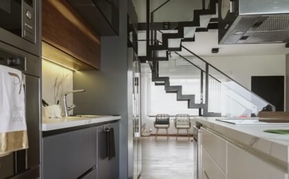
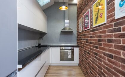
- Grazing light washes: Placing hidden perimeter LED strips or spotlights oriented in a grazing manner (from the false ceiling or under upper cabinets) over an exposed brick wall, a slatted panel, or a textured stone generates micro-shadows that tridimensionally enhance the material’s roughness.
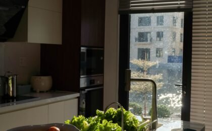
- Controlled reflections: Glossy surfaces dynamically react to changes in artificial light throughout the day, creating flashes that contrast wonderfully with the visual stability of surrounding matte finishes.
7. Chromatic harmony as the guiding thread of the mix
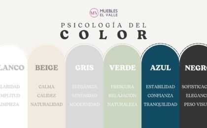
When playing with such a rich palette of textures (matte, gloss, rough, and smooth), color must act as a unifying and calming element to avoid sensory saturation.
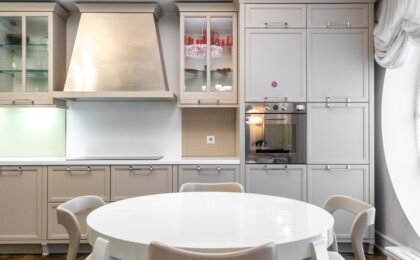
- Tonal monochromacy or neutral ranges: Opting for the same chromatic family (different shades of warm grays, sands, natural beiges, or desaturated earths) allows the complexity to reside exclusively in the textures, achieving a harmonic, elegant, and highly balanced space.
At Muebles El Valle, we understand that an exceptional kitchen design project goes far beyond the visible. We analyze and combine textures, mattes, glosses, and reliefs with artistic sensitivity and technical engineering to create spaces that captivate both the eye and touch, redefining the absolute comfort of your home.
0