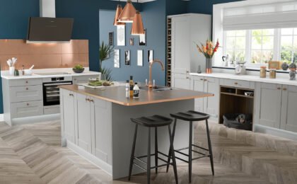
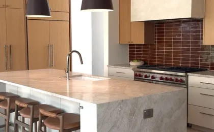
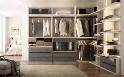
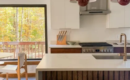
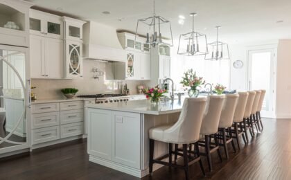
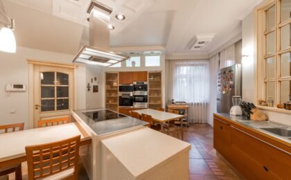
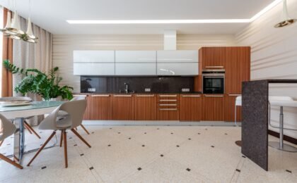
When we delve into the fascinating world of interior architecture and kitchen design and the spaces we inhabit daily, we tend to focus all our attention on furniture functionality, square footage distribution, or the selection of construction materials. However, there exists an invisible dimension—deeply evocative and possessing an extraordinary psychological power—that conditions our spatial perception, subtly regulates our moods, and directly moderates our physiological responses: color.
In the contemporary home, and very specially in spaces as vital, dynamic, and emotionally charged as the kitchen or dining room, the chromatic palette we choose never responds to mere aesthetic coincidence or a passing trend. Each hue acts as a direct neuropsychological stimulus that communicates silently with our central nervous system. Why do certain fast-food restaurants systematically use vibrant combinations that invite urgency and immediate consumption? Why, on the contrary, does an environment dominated by earthy tones or soft pastel ranges immediately invite tranquility, a leisurely after-dinner chat, and relaxed digestion?
Analyzing in depth the psychology of color in the interaction between human appetite, daily mood, and kitchen design grants us a truly powerful design tool. Below, we break down how different tones influence our eating behavior and emotional health.
1. Warm and stimulating tones: The territory of appetite, energy, and vitality
Warm colors—indisputably led by reds, intense oranges, vibrant yellows, and deep corals—possess an expansive, energetic nature that immediately captures visual attention. Biologically and evolutionarily, our brain instinctively associates these hues with the optimal ripeness of wild fruits, the energy of sunlight, and the comforting warmth of fire.
- Passionate red and its impact on metabolism: Red is par excellence the color of ravenous appetite and physical stimulation. Various studies in applied neuroscience show that exposure to this color subtly accelerates heart rate, raises blood pressure, and stimulates gastric juice secretion. In a kitchen design, introducing details in red (such as high-gloss cabinet fronts, small appliances, or specific decorative elements) infuses dynamism and vibrant vital energy. However, its use must be dosed with extreme caution; an excess of saturated red across continuous surfaces can generate visual fatigue, anxiety, and a feeling of spatial claustrophobia.
- Comforting orange: Positioned halfway between the vitality of red and the joy of yellow, orange stimulates sociability, culinary creativity, and appetite in a much more balanced and friendly way. It is an extraordinarily propitious tone for office areas, integrated dining rooms, or accent walls where the goal is to foster fluent conversation and the enjoyment of food in a cheerful atmosphere.
- Stimulating yellow: Closely linked to mental clarity, optimism, and sunlight, yellow stimulates the brain centers associated with appetite and joy. Soft or powdery yellow hues increase the natural luminosity of kitchens with little direct light entry, generating visually wider, more welcoming spaces brimming with positive energy.
2. Cool and serene tones: The pursuit of balance, calm, and control
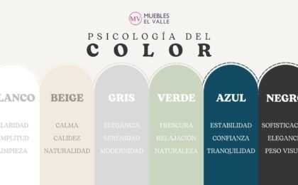
At the opposite end of the chromatic circle, we find cool tones: the vast range of blues, nature-inspired green hues, and sophisticated grays. These colors possess a short wavelength that innately transmits a deep sense of tranquility, stillness, and decreased metabolic activity.
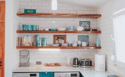
- Blue and its paradoxical appetite-suppressant effect: In the field of nutritional psychology, blue occupies a fascinating and singular place. Being an extremely infrequent color in nature among edible and healthy foods (with the exception of certain forest berries), our primitive brain often interprets it as a warning sign or spoilage. For this reason, pure blue acts as a powerful natural appetite inhibitor or suppressant. In a kitchen design, dark or vintage blues are reserved to provide sober elegance, an air of nautical sophistication, or a very measured aesthetic contrast, being ideal for those seeking to moderate impulses of constant snacking. Conversely, very light sky blues provide a diaphanous freshness and absolute calm.
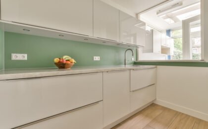
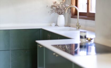
- Natural green: The color of health and organic well-being: Green is the great visual equalizer of the home. Uniquely associated with nature, the freshness of vegetables, sustainability, and healthy living, this tone transmits highly restorative inner peace. Variants of sage green, olive green, or eucalyptus tones have become authentic vanguard trends in contemporary kitchen design. They favor a relaxed mood, reduce accumulated stress levels from the workday, and stimulate appetite toward healthy, fresh, plant-based culinary options.
3. Neutral and organic tones: The timeless foundation for emotional harmony
Neutral colors—ranging from pure whites, luminous creams, warm beiges, sands, pearl grays, and the entire range of natural earths and woods—constitute the perfect architectural canvas upon which the emotional balance of the home is sustained.
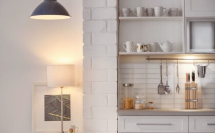
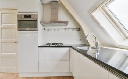
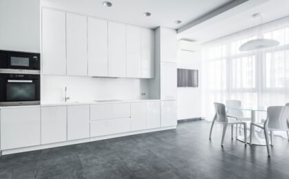
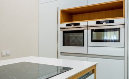
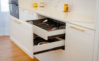
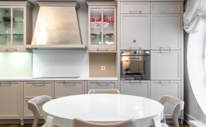
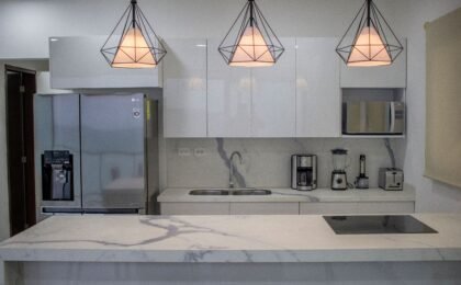
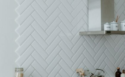
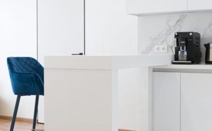
- The luminous neutrality of white and beiges: Pure white transmits impeccable cleanliness, absolute order, and unparalleled spatial amplification. However, an excess of cold, clinical whites can feel impersonal or intimidating. Combining broken whites with soft sands and beiges provides a very comfortable tactile warmth that prevents psychological fatigue and predisposes the mind to mental rest.
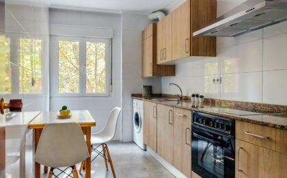
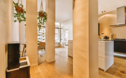
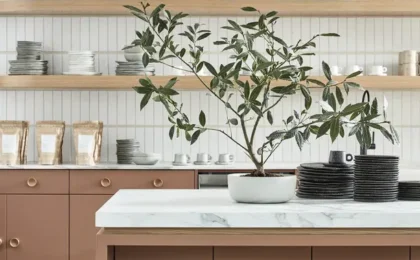
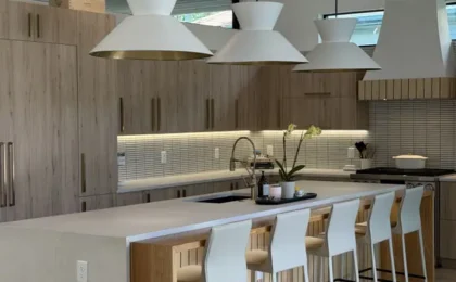
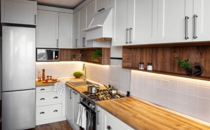
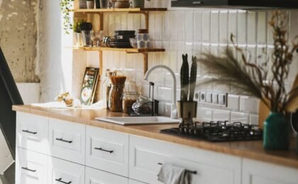
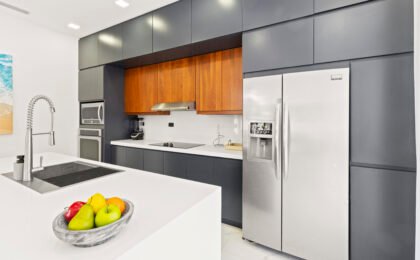
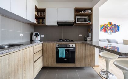
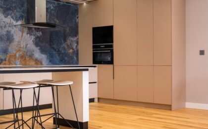
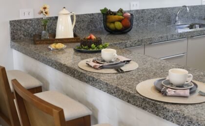
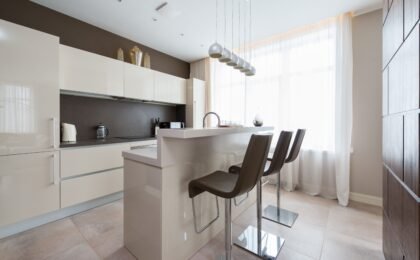
- The power of wood and earth tones: Browns in their various expressions, from natural oak to soft clays and terracottas, connect human beings directly to their ancestral roots. These tones generate an emotional microclimate of security, refuge, stability, and incomparable home comfort. In kitchen design, the integration of wood textures mitigates the coldness of stainless steel appliances or synthetic stone countertops, achieving a deeply harmonious space where one wants to cook and share long moments with family.
4. Applied chromatic strategies: How to masterfully combine color, light, and space
The practical application of color psychology in kitchen interior architecture does not consist of dyeing all surfaces the same tone, but rather of orchestrating a coherent visual symphony that intelligently dialogues with the artificial and natural lighting of the room.
- The fundamental role of light: A warm color exposed to cold LED lighting (above 4000K) will lose much of its cozy character, becoming strident or artificial. Similarly, cool colors in spaces with scarce natural lighting can accentuate an atmosphere of sadness or gloom. It is essential to plan warm, dimmable lighting that enhances the nuances of the chosen materials.
- Zoning through color: We can use different chromatic ranges to delimit functions within the same open-plan space. For example, employing neutral, relaxing tones in the storage and general preparation column area, reserving green or wood tones for the daily dining area, and applying subtle notes of more stimulating colors in accessories or tableware to awaken the senses precisely when serving food.
At Muebles El Valle, we understand that every color tells a unique story and awakens unrepeatable emotions. We analyze with artistic sensitivity and technical rigor the perfect chromatic palette for your home, designing spaces where aesthetics, emotional well-being, and the pleasure of gastronomy merge in perfect harmony.
0